
Image Optimization for the Web: Formats, Lazy Loading, and CDNs
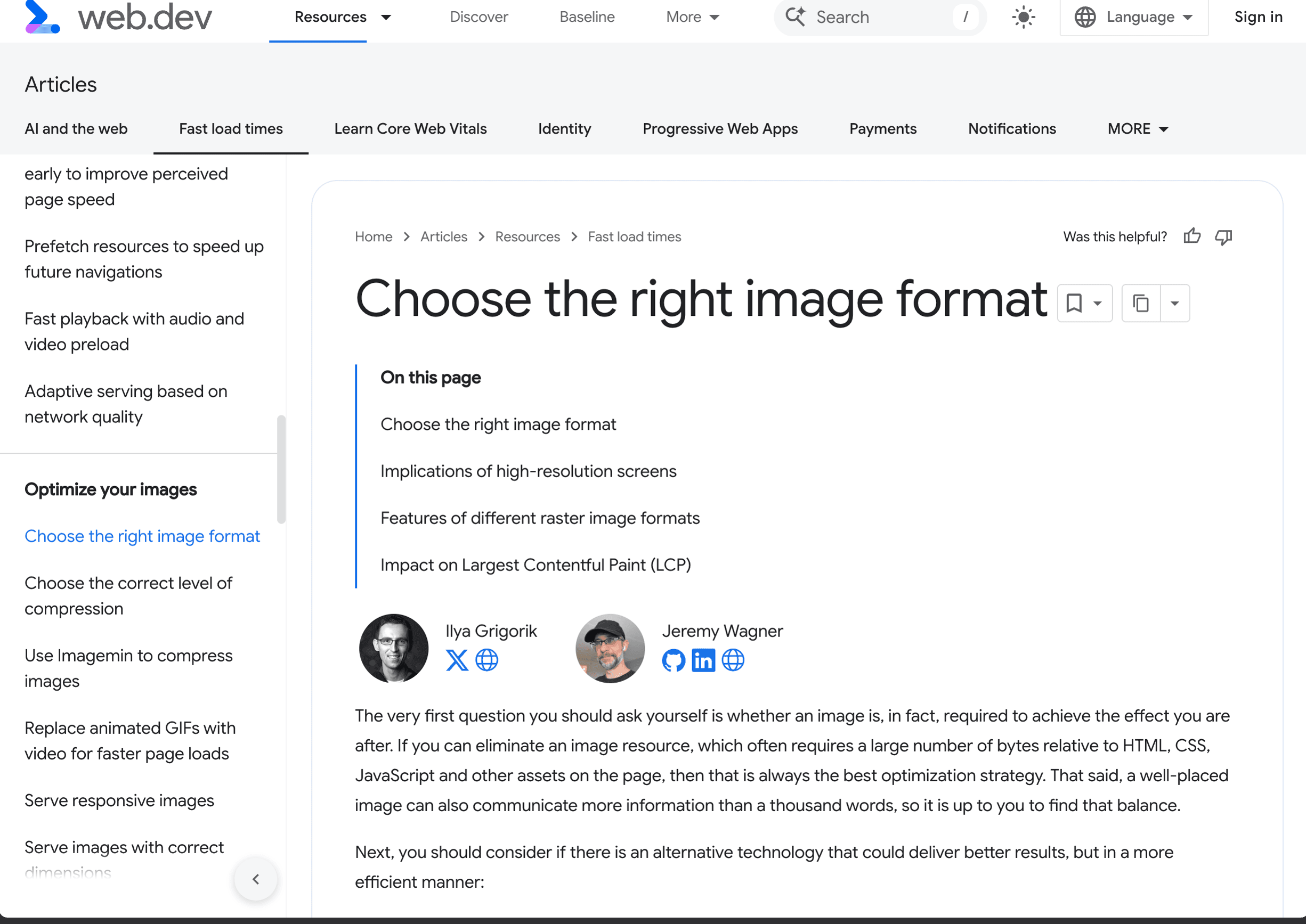
Images are often one of the biggest opportunities to reduce page weight and improve Largest Contentful Paint. A single unoptimised hero image can outweigh the JavaScript needed for a simple page, consume unnecessary data, and delay the largest visible element on slower connections.
Here's what Dev3 Studio does on every project.
Modern Image Formats
The format landscape has shifted. Here's what matters:
JPEG — the old reliable. Good compression for photographs, still the fallback for older browsers. PNG — lossless, supports transparency. Use for logos and sharp-edged graphics, avoid for photographs. SVG — vector format for icons, logos, and illustrations. Infinitely scalable, styleable with CSS.
WebP — Google's compression study found lossy WebP images were 25–34% smaller than comparable JPEG images at equivalent SSIM quality. It supports transparency and is a strong default for modern browsers.
AVIF — can compress even further for many photographs, but results vary by image and encoding is slower. Serve AVIF first with WebP and JPEG fallbacks when your delivery pipeline supports it.
Dev3 Studio's default: AVIF with WebP fallback and JPEG as the last resort. The <picture> element makes this straightforward:
<picture>
  <source srcset="/images/hero.avif" type="image/avif" />
  <source srcset="/images/hero.webp" type="image/webp" />
  <img src="/images/hero.jpg" alt="Project showcase hero image" width="1200" height="630" />
</picture>
The browser evaluates the <source> elements in order and uses the first compatible candidate, falling back to the <img> element.
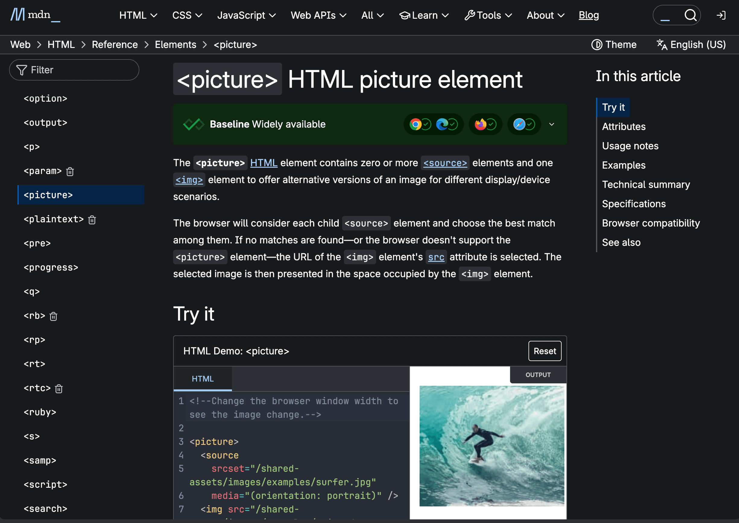
picture reference documents source selection for formats, media conditions, and art direction.Responsive Images
Stop serving a 2400px image to a phone screen. Use srcset and sizes to let the browser pick an appropriate source:
<img
  srcset="
    /images/hero-640w.webp   640w,
    /images/hero-1024w.webp 1024w,
    /images/hero-1536w.webp 1536w,
    /images/hero-2048w.webp 2048w
  "
  sizes="(max-width: 768px) 100vw, (max-width: 1200px) 75vw, 50vw"
  src="/images/hero-1024w.webp"
  alt="Project showcase"
  width="2048"
  height="1080"
/>
Generate multiple sizes at build time (640w, 1024w, 1536w, 2048w is a solid set). The sizes attribute tells the browser how wide the image will actually be displayed — without it, srcset is guessing.
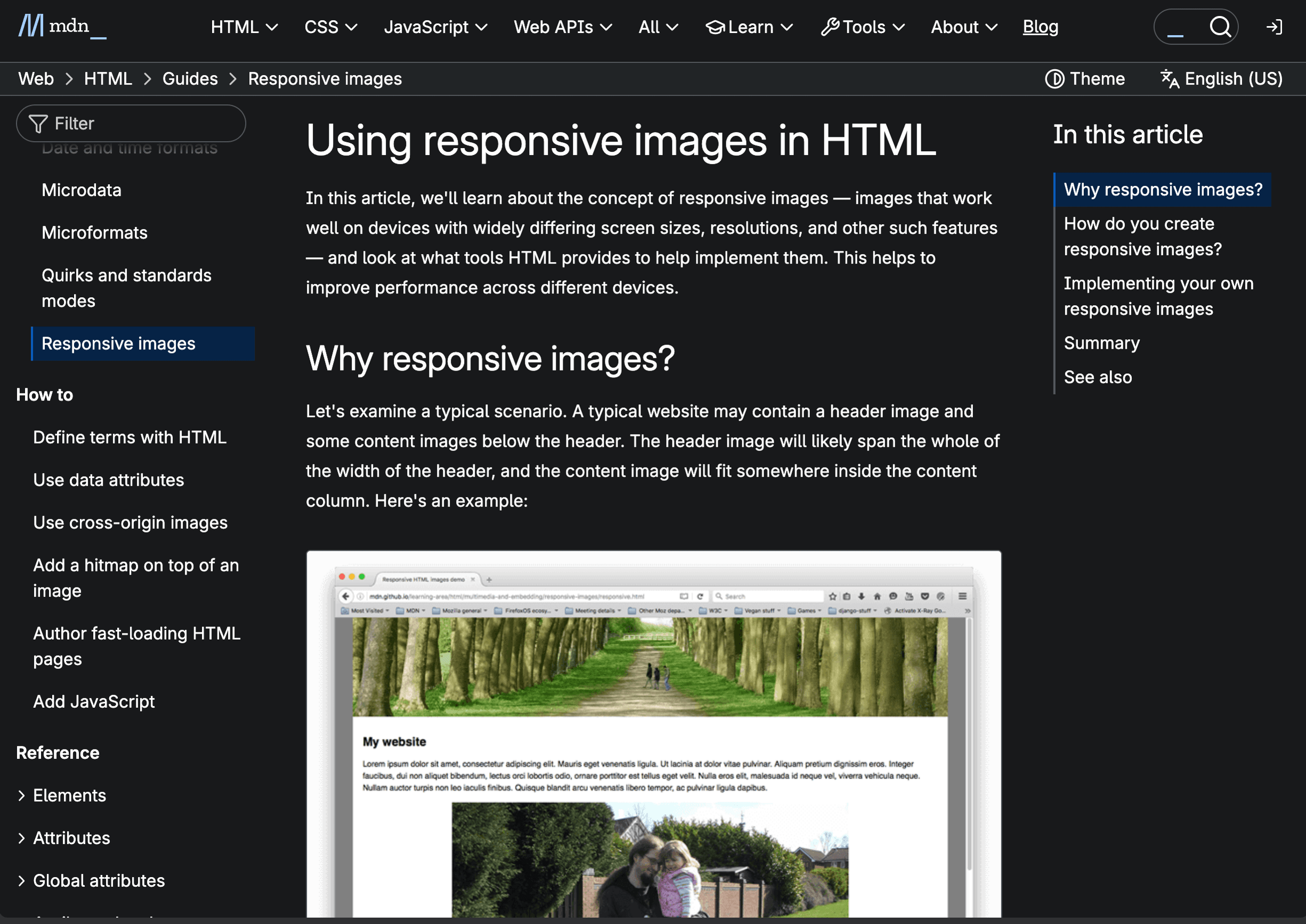
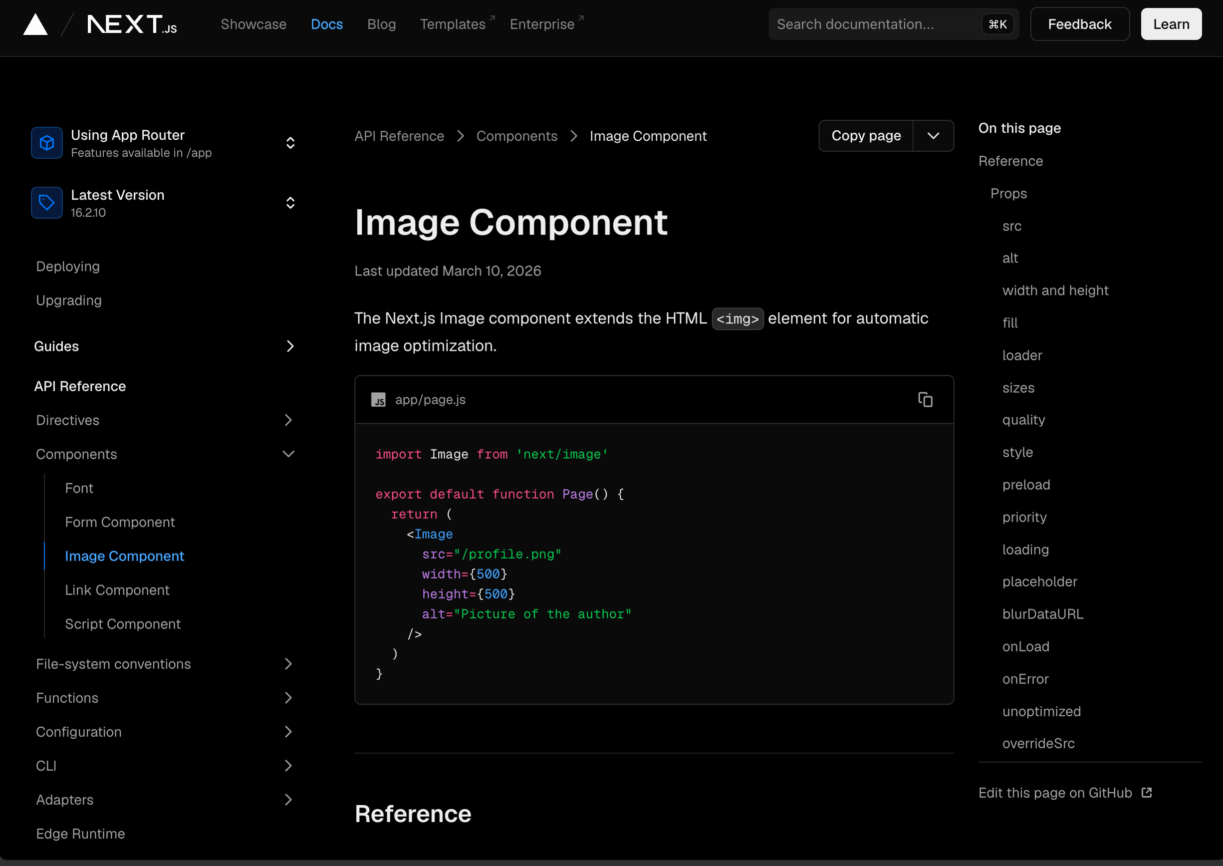
srcset and sizes let the browser select an appropriate resource.Frameworks like Next.js can handle much of this automatically. The next/image component generates responsive srcset candidates, preserves aspect ratio, lazy-loads by default, and can serve configured modern formats.
Lazy Loading
Native image lazy loading lets the browser defer off-screen images without application JavaScript:
<!-- Below-the-fold images: lazy load -->
<img src="/images/feature.webp" alt="Feature screenshot" loading="lazy" width="800" height="450" />

<!-- LCP / above-the-fold image: load eagerly with high priority -->
<img src="/images/hero.webp" alt="Hero image" loading="eager" fetchpriority="high" width="1200" height="630" />
Don't lazy load the image that is likely to become LCP. Your hero image and anything visible on initial load should use loading="eager" or omit the attribute. For the single most important image, fetchpriority="high" can help the browser discover and prioritise it. Use lazy loading for images that begin below the fold.
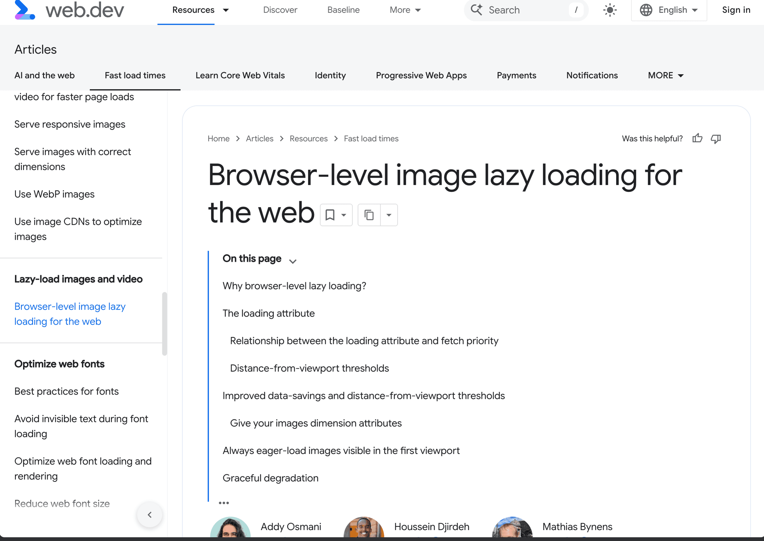
loading="lazy" and the cases where above-the-fold images should load eagerly.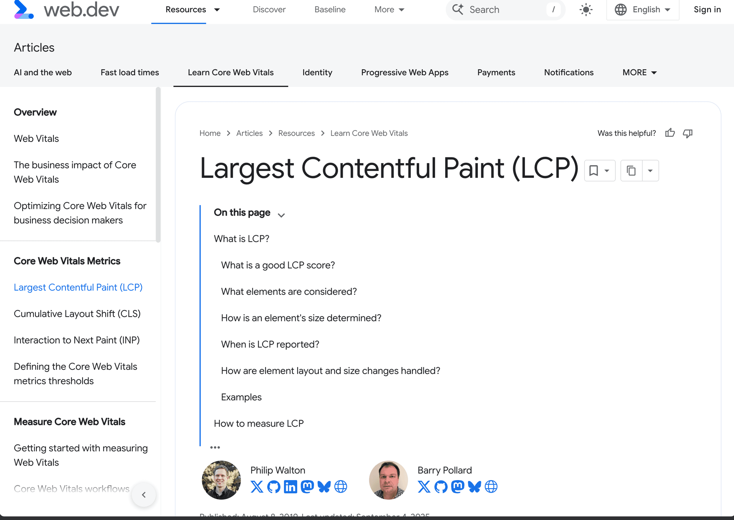
Compression
For JPEG and WebP, a quality setting around 75–85 is a useful starting point, not a universal rule. Compare representative images visually and choose the lowest setting that preserves the detail your design needs.
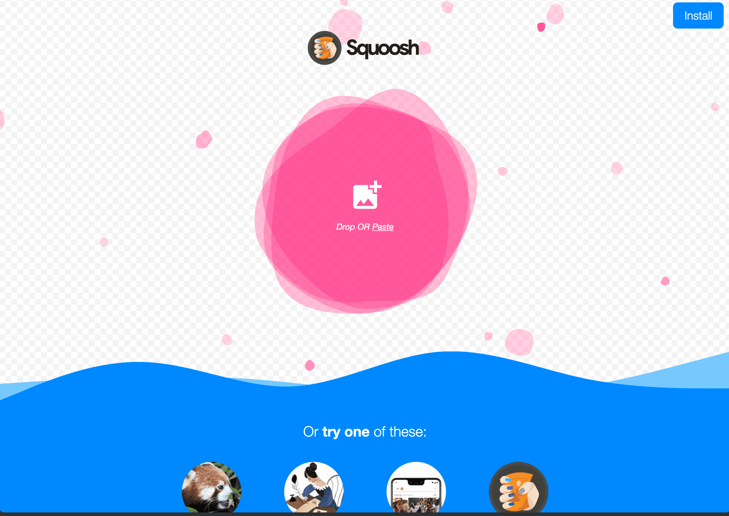
Tools that work well: Sharp for Node.js build pipelines, Squoosh for one-offs, and ImageMagick for CLI workflows. Use lossy compression for photographs and test lossless or near-lossless settings for screenshots and text-heavy images. Automate compression in your build pipeline — manual compression doesn't scale.
CDNs and Image Transformation
Don't serve images from your origin server if you can avoid it.
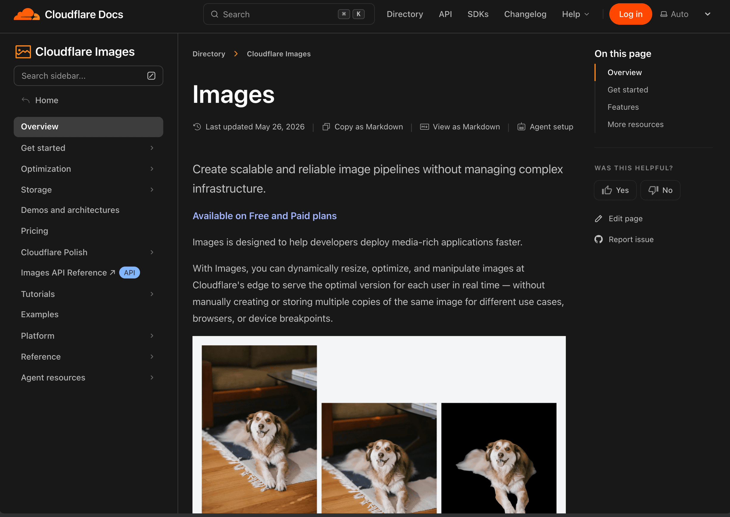
Cloudflare — its CDN caches eligible assets at the edge, while Polish adds plan-dependent image compression and format conversion. Vercel — next/image uses its Image Optimization API to resize and cache requested variants. Cloudinary and imgix — dedicated image CDNs with URL-based transforms. Powerful, but they add another service dependency.
Placeholder Strategies
What you show while images load matters for perceived performance and layout stability.
Blur-up — show a tiny, blurred version that transitions to the full image. Next.js supports this with placeholder="blur" and blurDataURL. Dominant color — fill the space with the image's dominant colour. Skeleton — use a neutral placeholder matching the image dimensions.
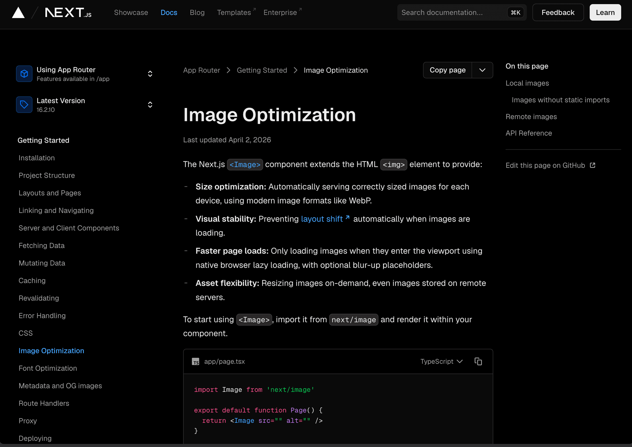
The non-negotiable: set width and height (or reserve the aspect ratio in CSS) so the browser can allocate space before the image loads. Unsized images can cause layout shifts that worsen CLS.
The Practical Checklist
What Dev3 Studio does on every project:
- Serve AVIF/WebP with JPEG fallback
- Generate responsive sizes with srcset
- Lazy load below-the-fold images
- Set
fetchpriority="high"on the LCP image - Compress to quality 80 (WebP) / 75 (AVIF)
- Serve through a CDN (Vercel or Cloudflare)
- Set explicit dimensions to prevent layout shift
- Use blur-up placeholders for hero images
- Run Lighthouse after every deployment
Image optimization isn't glamorous, but it's one of the highest-impact things you can do for web performance. A well-optimized site loads faster, ranks higher, costs less bandwidth, and respects your users' time and data. Do it once, automate it, and move on.