
Accessibility Basics Every Developer Should Know
Most of the web is broken for a significant number of people, and the fix is usually easier than you think.
The World Health Organization estimates that 16% of the global population experiences significant disability. In South Africa, Statistics South Africa reported a 7.5% national disability prevalence rate from Census 2011 data. But accessibility isn't only about permanent disabilities. It covers a spectrum:
- Permanent: blindness, deafness, motor impairments
- Temporary: a broken arm, an ear infection, a migraine
- Situational: using your phone one-handed while holding a baby, watching a video in a noisy room (captions help everyone), reading a screen in bright sunlight (contrast matters)
Good accessibility is good UX for everyone. Curb cuts were designed for wheelchairs but are used by everyone with a stroller, suitcase, or bicycle. The same principle applies to the web.
There's also the legal angle. South Africa's Constitution protects equality and dignity and expressly lists disability as a protected ground, while the Promotion of Equality and Prevention of Unfair Discrimination Act (PEPUDA) prohibits unfair discrimination. How those laws apply to a particular digital service depends on the facts, so get legal advice when compliance is material. But the everyday reason to care is simpler: it's good engineering.
Semantic HTML — The Foundation
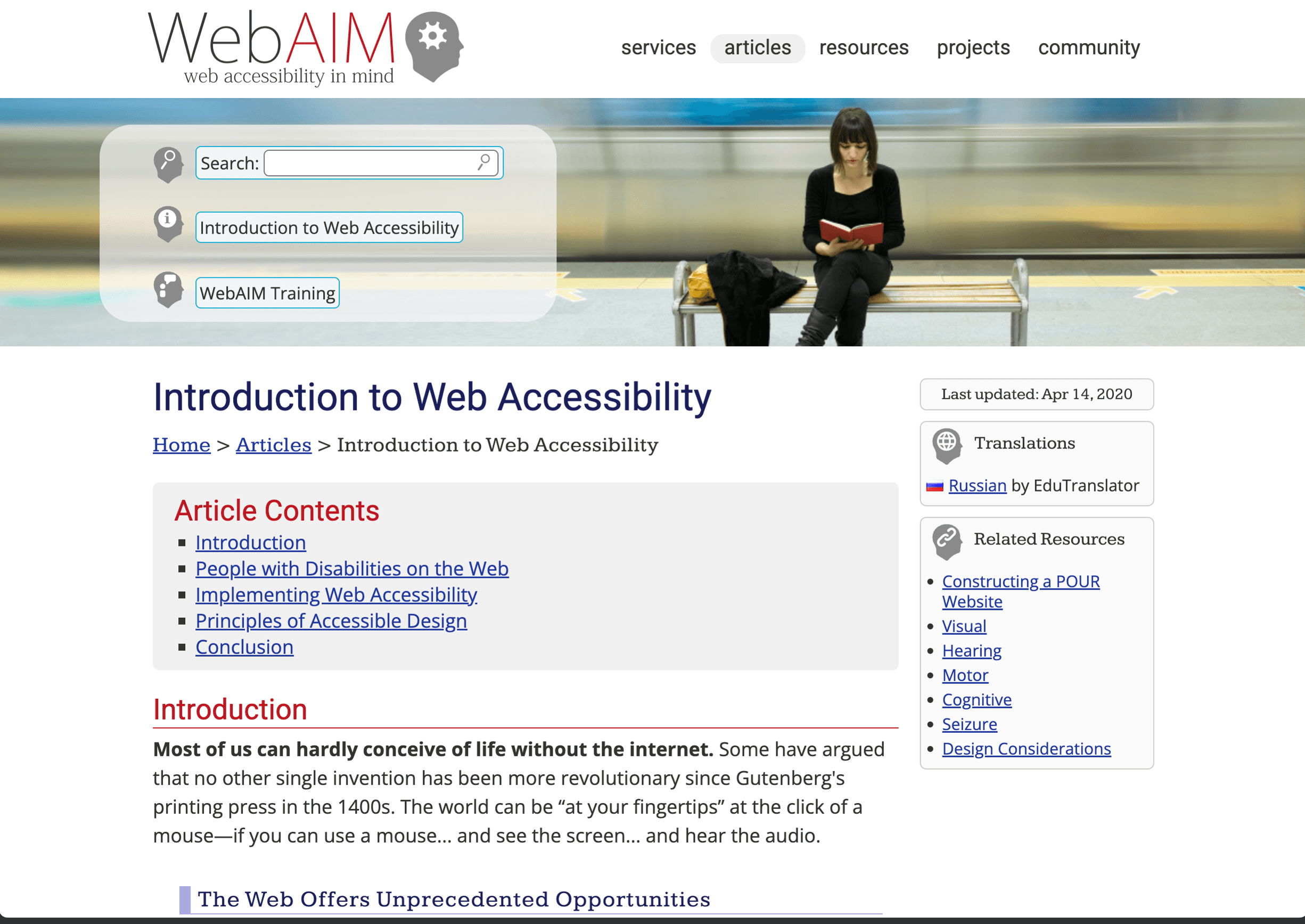
The single highest-impact thing you can do for accessibility costs zero extra effort: use the right HTML elements.
A <div onclick="..."> has no keyboard support, no screen reader announcement, no focus management. A <button> has all of these for free. You actually have to do extra work to make a div behave like a button, and it'll still be worse.
<!-- Don't do this -->
<div class="btn" onclick="handleClick()">Submit</div>

<!-- Do this -->
<button onclick="handleClick()">Submit</button>
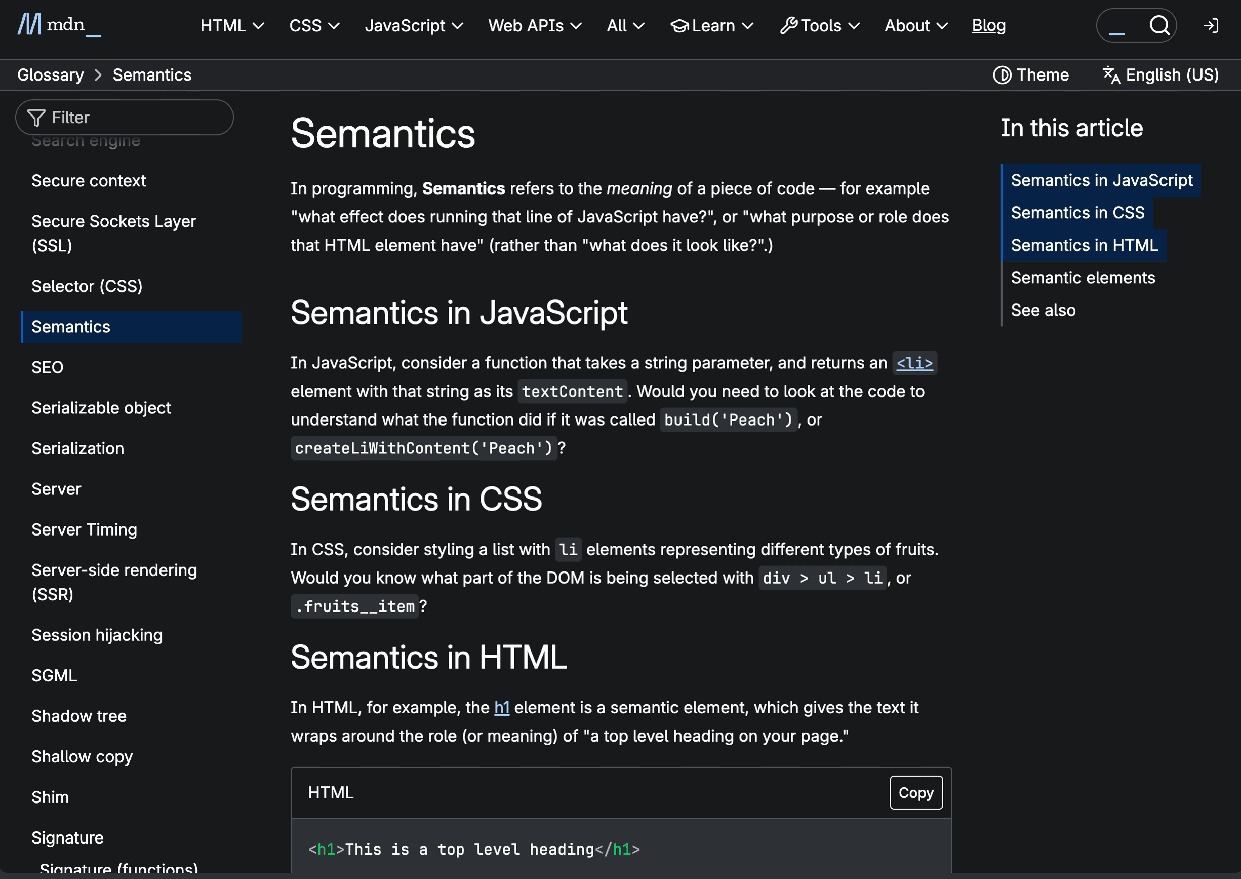
Use landmark elements and a meaningful page structure — <nav>, <main>, <header>, <footer>, <aside>, <section> — so screen reader users can jump between page regions. Use heading levels (<h1> through <h6>) in order. Don't skip from h1 to h4 because you like the font size. Use CSS for styling, HTML for structure.
Other rules that pay off immediately: use <a> for navigation and <button> for actions. If clicking it changes the URL, it's a link. If it triggers something on the page, it's a button. Always pair <label> with form inputs — a placeholder is not a label. Use <table> for tabular data (with <th> and scope), never for layout.
Keyboard Navigation
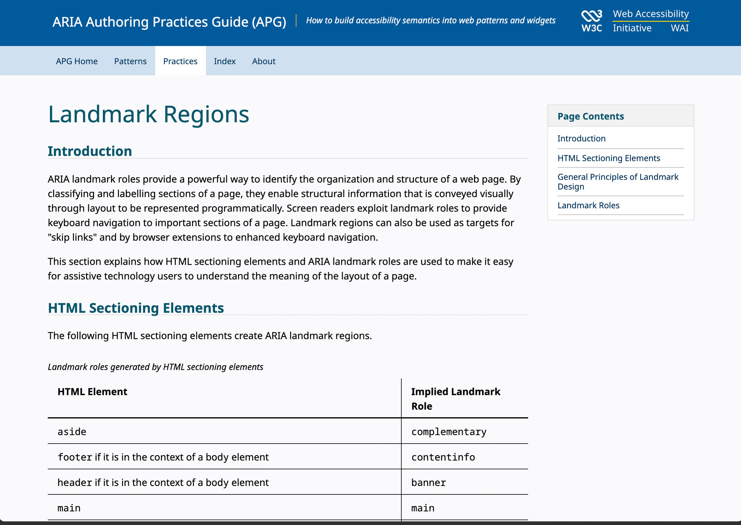
Every interactive element must be usable without a mouse. The basics: Tab to navigate between elements, Enter or Space to activate, Escape to close, Arrow keys within menus and tabs.
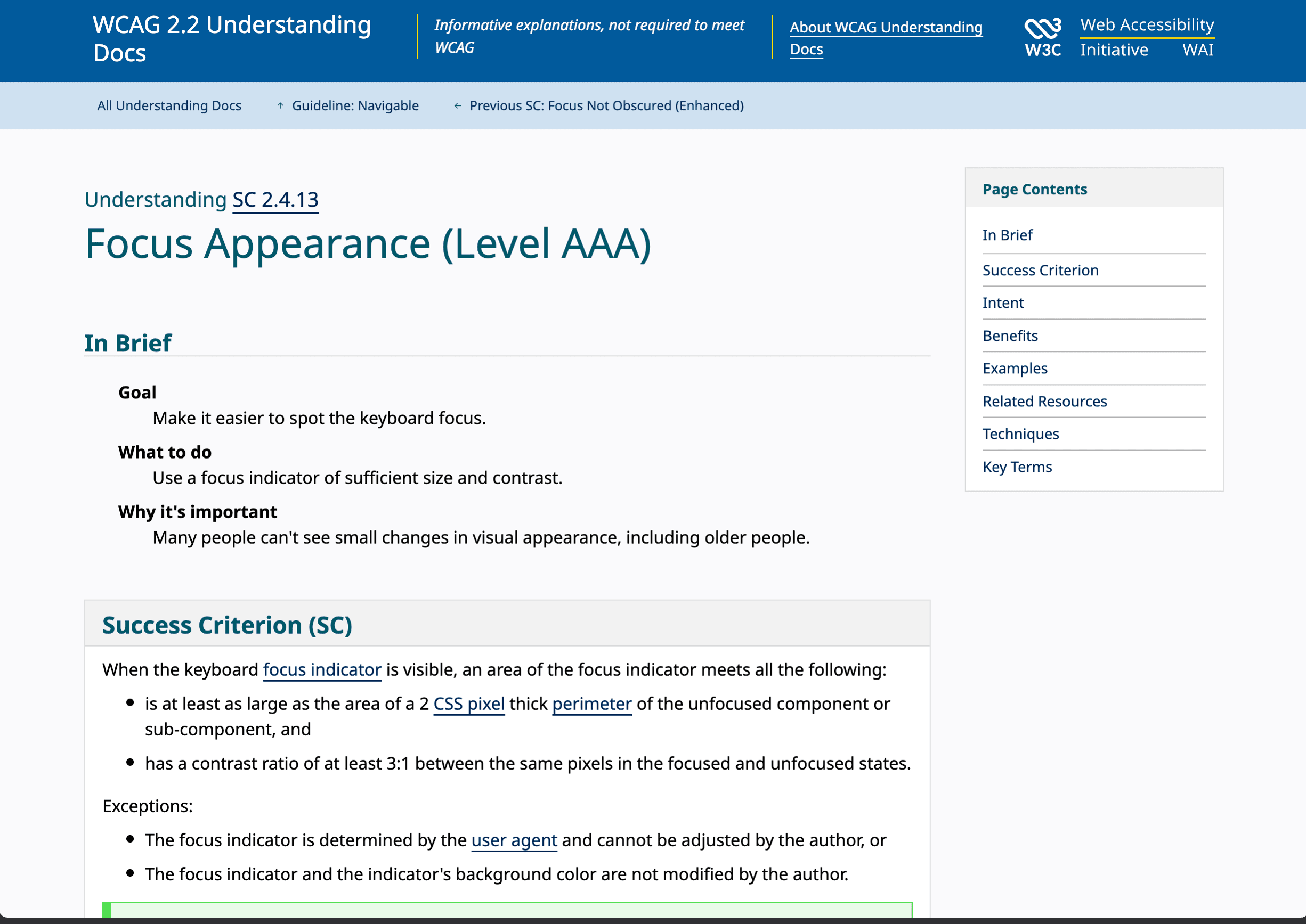
Never remove focus outlines without providing a visible alternative. This is the single most common accessibility sin in modern web development:
/* Never do this */
*:focus {
  outline: none;
}

/* Do this instead — outlines for keyboard users, not mouse clicks */
:focus-visible {
  outline: 2px solid #4A90D9;
  outline-offset: 2px;
}
Test your entire UI by putting your mouse in a drawer and navigating with only the keyboard. You'll find problems fast.
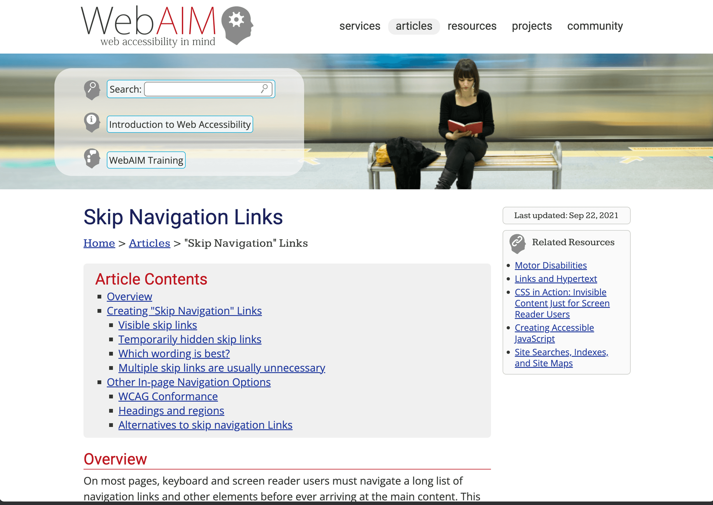
For custom interactive elements: tabindex="0" makes an element focusable in the normal tab order. tabindex="-1" makes it focusable only via JavaScript (useful for modals and skip links). Never use tabindex values greater than 0 — they create an unpredictable tab order.
When a modal opens, trap focus inside it. Tab should cycle within the modal, not escape to the page behind it. When the modal closes, return focus to the element that opened it.
Color and Contrast
WCAG's Level AA minimum contrast rule requires a 4.5:1 ratio for normal text and 3:1 for large text, with specific exceptions and a technical definition of "large." These thresholds improve readability across a range of vision levels and lighting conditions.
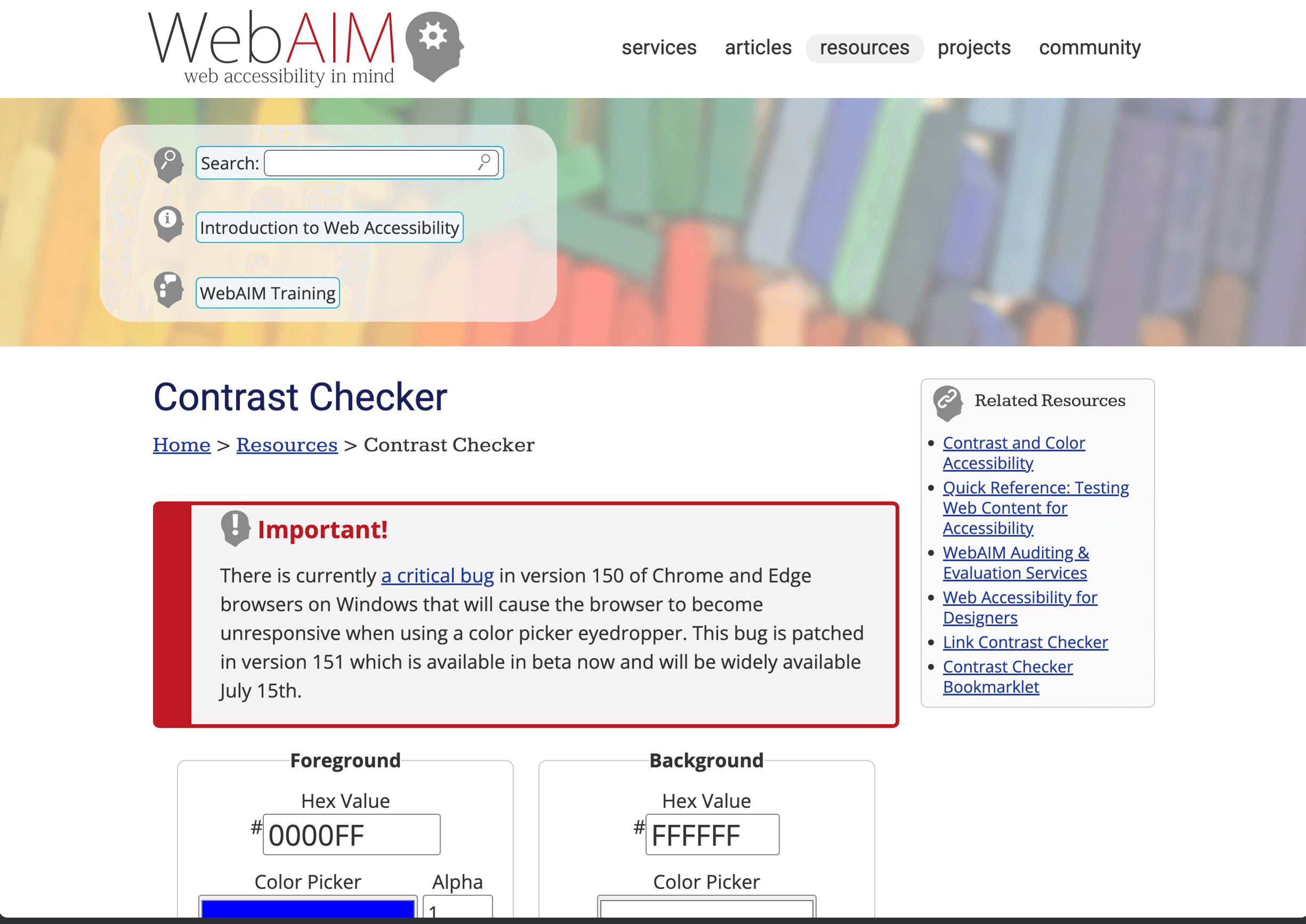
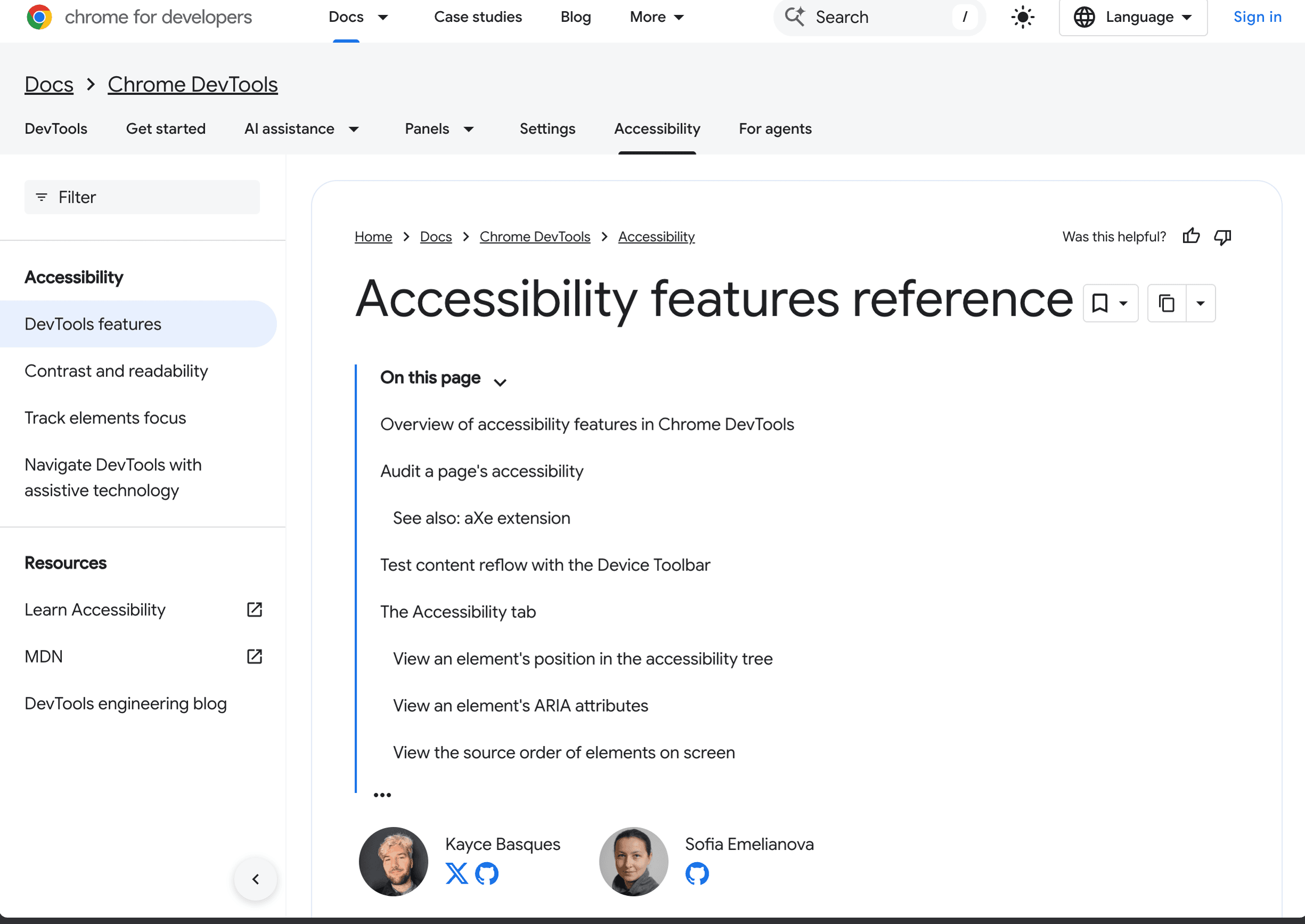
Use a contrast checker. WebAIM's Contrast Checker is a quick web tool. Chrome DevTools shows contrast ratios right in the color picker when you inspect an element.
Never convey information through color alone. If a form field is invalid, don't just turn the border red — add an icon or error message too. Colour vision deficiency affects roughly 1 in 12 men, so that red error border may look identical to the default grey.
Images and Alt Text
Every image needs an alt attribute. The W3C alt-text decision tree is a useful reference because what goes in the attribute depends on the image's purpose:
- Decorative images: Use
alt=""(empty string, not missing). This tells screen readers to skip it entirely. If you can remove the image and the page still makes complete sense, it's decorative. - Informative images: Describe the purpose, not the appearance. A chart showing revenue growth:
alt="Revenue grew 40% from Q1 to Q4 2025"— not "a bar chart with blue bars." - Functional images (inside links or buttons): Describe the action. A magnifying glass in a search button:
alt="Search"— not "magnifying glass icon." - Complex images (charts, infographics): Provide the data in text form nearby, or link to a longer description with
aria-describedby.
ARIA — Use Sparingly
ARIA (Accessible Rich Internet Applications) fills gaps where HTML falls short. But the first rule of ARIA is: don't use ARIA if native HTML can do the job. A <button> is always better than <div role="button">.
When ARIA is genuinely useful:
<!-- Label for an icon-only button -->
<button aria-label="Close menu">
  <svg><!-- X icon --></svg>
</button>

<!-- Expandable section -->
<button aria-expanded="false" aria-controls="details-panel">
  More details
</button>

<!-- Live region for dynamic updates -->
<div aria-live="polite">3 items added to cart</div>
Bad ARIA is worse than no ARIA. Incorrect roles and states confuse assistive technology more than missing ones do. If you don't understand what an ARIA attribute does, leave it out and use semantic HTML instead.
Forms
Forms are where accessibility most often falls apart. Every input needs a visible <label> linked with htmlFor (or for in plain HTML). Group related fields with <fieldset> and <legend>. Connect error messages to their inputs with aria-describedby:
<label for="email">Email address</label>
<input
  id="email"
  type="email"
  autocomplete="email"
  aria-describedby="email-error"
/>
<p id="email-error" role="alert">Please enter a valid email address.</p>
One counterintuitive tip: don't disable the submit button while fields are incomplete. Disabled buttons are invisible to many screen reader users and don't explain what's wrong. Let users submit, then show clear validation errors.
Testing Your Work
Automated accessibility tools can identify many common problems, but no tool can determine whether a site is fully accessible. Combine automation with manual keyboard and assistive-technology testing.
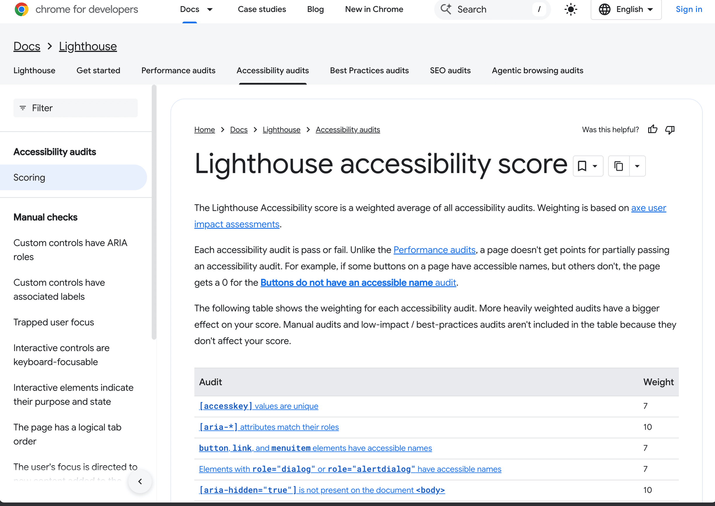
- Lighthouse (Chrome DevTools > Lighthouse > Accessibility) — run it as a baseline. Fix everything it flags, but don't assume a perfect score means a perfect experience.
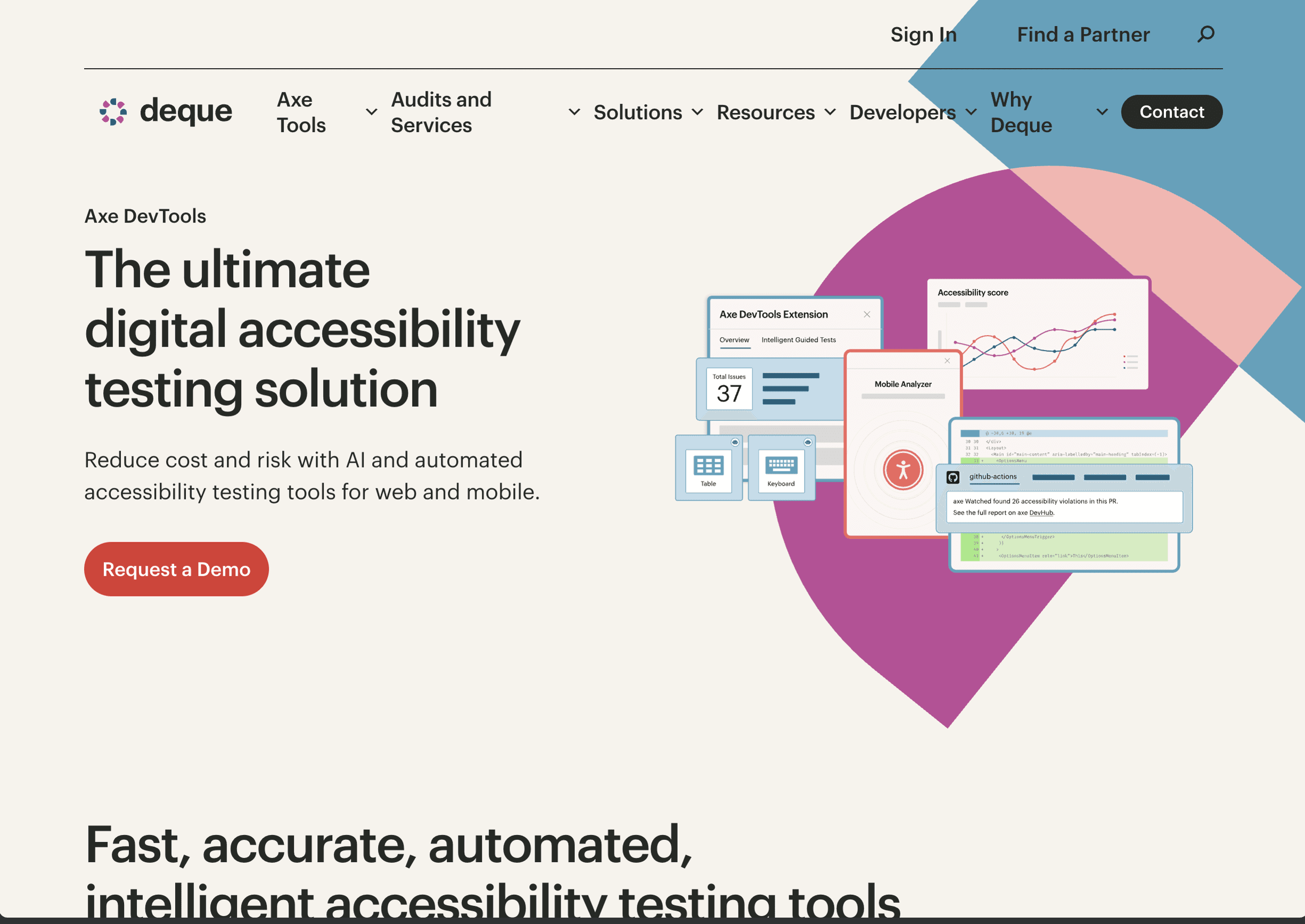
- axe DevTools — a browser extension by Deque that catches more issues than Lighthouse and explains how to fix each one.
- Keyboard testing — navigate your entire site with Tab, Enter, Escape, and Arrow keys. Can you reach every interactive element? Can you always see where focus is? Can you escape from every modal?
- Screen reader testing — VoiceOver is built into macOS (Cmd+F5). NVDA is free on Windows. TalkBack is built into Android. Even 10 minutes of screen reader testing will change how you build.
Quick manual checklist: Can you complete every task without a mouse? Does every image have appropriate alt text? Does every form input have a visible label? Can you always see where keyboard focus is? Is content readable at 200% zoom?
Accessibility isn't a feature you add at the end — it's a way of building. Start with semantic HTML, test with a keyboard, check your contrast, and write meaningful alt text. These four habits alone will put you ahead of most of the web. The bar is low. Raise it.